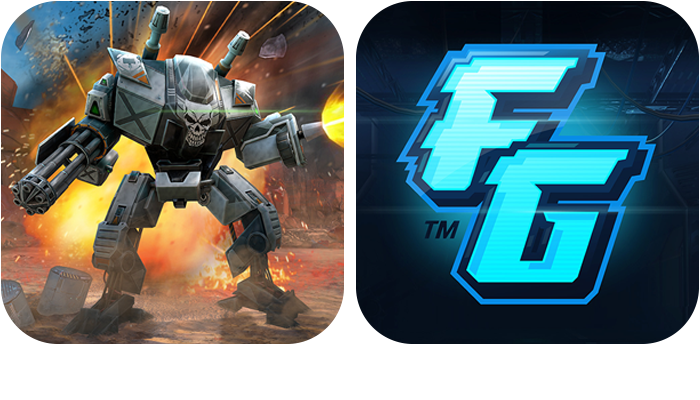
After a testing period of four weeks or so this turned out to be the best performing icon even when I assumed a character motif would take the cake.
Logo based fall-back app icon solution.

Needless to say that this is something I enjoyed a lot.
For each faction there's a full logo set plus a tiny design manual with decorative colors and stuff like that. Could have done this all day for 28 months straight.
I will post a collection of that with the next site update.

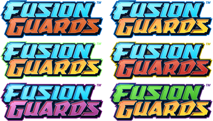
After living with the all-blue version for month I really liked to play around with silly colorways. None of those were serious attempts but still interesting what a bit more vibrance can do.